YouTube's watch page has spent years accumulating interface elements the way a desk accumulates paperwork. Buttons for sharing, clipping, saving, remixing, shopping links, and a dozen other actions now stack beneath every video, and the resulting wall of controls has become one of the busiest stretches of real estate on the modern web. Now the platform is testing a visibly simpler answer, and early impressions suggest the cleanup is far more substantial than a cosmetic tweak.
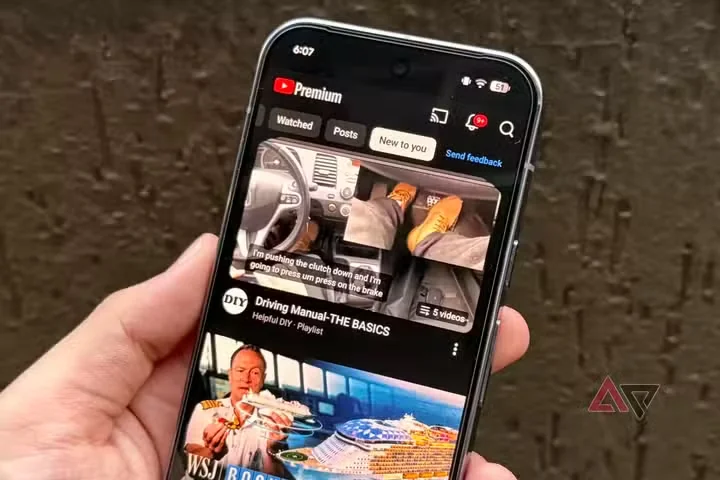
The redesign collapses much of that toolbar clutter into a tighter, more restrained layout. Actions that once demanded individual buttons are grouped or demoted, leaving the title, channel information, and description as the dominant elements on the page. The effect is immediate: the area directly under the player reads like a video page again rather than an aircraft cockpit, and the first thing most people notice is how much visual noise they had stopped consciously seeing.
There is a strategic logic behind the experiment. YouTube has been steadily trimming engagement mechanics introduced during previous growth pushes — public dislike counts were the most famous casualty — while simultaneously steering viewers toward Shorts and its own commerce tools. A cleaner watch page also lowers the friction that mobile and television interfaces have struggled with for years, where small screens and remote controls amplify every redundant button.
Nothing has shipped globally yet, and YouTube's history of testing, retreating, and testing again means the final design may differ from what is circulating now. But the direction of travel is clear: the era of the maximalist watch page appears to be ending, and creators watching retention metrics will learn quickly whether fewer buttons actually produce more watching.