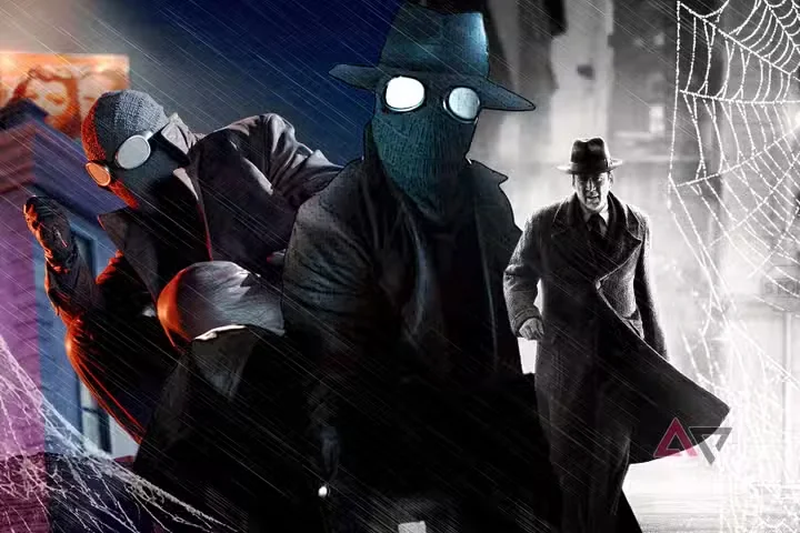
Prime Video's new animated Spider-Man series arrives with an unusual gimmick: every episode can be watched in full color or in a stark black-and-white presentation, and after sampling both, the verdict is not close. The monochrome mode is not a filter slapped on during export — it is the version the show was clearly built around, and it transforms a competent superhero cartoon into something that genuinely feels like film noir.
Set during the Great Depression, the series reimagines Peter Parker as a hard-boiled young detective in a shadow-drenched Manhattan where the lighting design leans entirely on venetian-blind shadows, streetlamp pools and cigarette haze. In black and white, every frame reads like a living 1940s photograph; in color, the same scenes flatten into ordinary animation, and the deliberately muted palette the artists chose looks almost apologetic for what it is trying to evoke.
The comparison is a useful case study in how presentation shapes genre. Spider-Man Noir originated as a comic concept precisely because monochrome conjures the era the story imitates, and this series understands that its audience comes for atmosphere as much as for action. Viewers watching with the lights on, on a phone, in color, are experiencing a measurably lesser version of the same episode.
The practical recommendation is simple: start in monochrome, and if the central mystery pulls you in, finish it there. The color option exists as a concession to preference and accessibility, but this is one of the rare streaming experiments where the alternative default is clearly the better one.