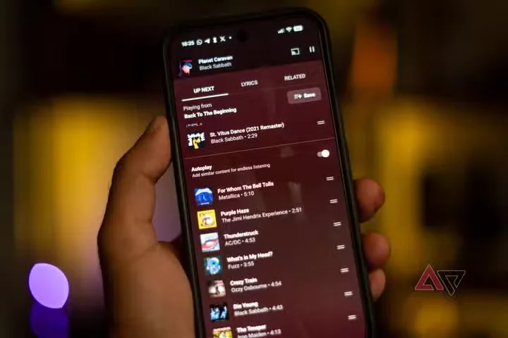
The screen you stare at most while listening to music is finally getting attention. YouTube Music has begun rolling out its redesigned Now Playing interface, the full-screen view that hosts playback controls, lyrics, and recommendations, and which has accumulated complaints for years. The update arrives in staged waves across Android and iOS, meaning some subscribers will see it within days while others wait for the rollout to reach their account.
Visually, the redesign trades the previous layout's clutter for a cleaner hierarchy: album art dominates the upper portion, transport controls sit lower and larger for one-handed use, and the up-next queue slides in without leaving the screen. Google has also reworked how related content surfaces, integrating vertical video suggestions that reflect the company's ongoing effort to treat music and video as a single product rather than two parallel apps.
The change matters because YouTube Music occupies an unusual position in the streaming market. It is the only major service whose catalog is built substantially from user-uploaded video, which makes live performances, remixes, and obscure uploads discoverable in ways competitors cannot match — but also makes its interface harder to design for. Critics of the old screen argued it buried those strengths under redundant buttons.
Early reactions from power users are cautiously positive, with the loudest complaint being predictability: Google has redesigned this screen before, and some listeners fear the new layout is a waystation toward another round of changes rather than a final destination.